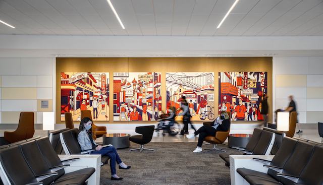
San Francisco is known for its rich culture, natural and built environments, and the way it leaves people wanting more every time they visit. That’s why, when it came time to redesign…

Rethinking What’s Possible: Bentley’s Next Step Toward a Circular Future Across the commercial flooring industry, the stakes are rising. Designers and end users alike are navigating a fast-changing landscape where climate impact,…

As a premium brand that operates at the highest levels of responsible manufacturing and innovation, we understand that true sustainable impact is a collaborative effort with partners that share this mission of…
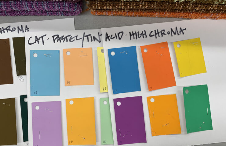
We are excited to share a Bentley article about our COLORCAST Lab that is currently being featured on the DesignMilk.com homepage. Design Milk’s A Playdate With Color: Artist Gretchen Wagner Turns Bentley…
In this segment from NeoCon Now, Interior Design Market Editor Rebecca Thienes is joined by Ginger Gilbert from Bentley Mills Los Angeles for Product Live.

With clean lines and classic structure, this palette is perfectly tailored for virtually any application – from boardroom to dorm room.
Sunset is not simply a daily occurrence, it’s also a state of mind. It’s calming moments that end the hours behind us, while at the same time preparing us for the new energy of the night. It’s the brightness and warmth of the sun expertly blended with the rich, darkness of the horizon. No matter where you are in the world, sunset is a magically and mysterious transition that envelopes the senses and sets the stage for the dawn of a new day.
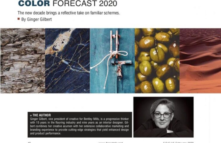
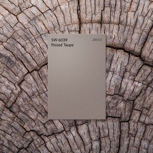
Tis the season for new year predictions. Right now, the design world is all abuzz about the color palettes expected to define 2017. Paint powerhouses Sherwin-Williams and Benjamin Moore recently named their colors of the year: Poised Taupe, a weathered neutral, and Shadow, a moody amethyst. But it’s the pick from the color forecasting authority Pantone that really has us talking.